A product can be objectively good and still fail online.
It can solve a real problem. It can be priced fairly. It can have a strong team behind it. It can even get traffic.
And yet, visitors still leave. They don’t sign up. They don’t book a call. They don’t purchase.
Most teams react to this with surface-level fixes:
They tweak the button color.
They add more features to the hero.
They rewrite the headline three times.
They add more testimonials.
Sometimes these changes help. Often, they don’t.
Because the real issue isn’t persuasion.
It’s clarity.
There is a hidden obstacle that blocks conversion long before users evaluate your product’s value. It sits between attention and action. It creates hesitation. It increases mental effort. It makes even the best product feel like “maybe later.”
That obstacle is what we call the Clarity Gap.
This article explains what the Clarity Gap is, how it silently destroys conversion, what it looks like in real websites, and how to close it with decisions that actually move metrics.
What the “Clarity Gap” Actually Is
The Clarity Gap is the space between what your product is and what users understand it to be.
It happens when your business is clear in your head, but unclear on the screen.
You know your product is valuable. Your team knows your offer is strong. Your customers might even love it once they onboard. But the website fails to communicate that value fast enough and clearly enough for a new visitor.
In other words:
Your product is good.
Your communication is not.
Clarity is not just “good copy.” It’s the entire experience of understanding:
- What this product is
- Who it is for
- Why it matters
- What to do next
- What happens after you do it
When any of these are missing, users pause. They hesitate. They scroll without purpose. They open a new tab. They bounce.
The Clarity Gap is not always obvious, because the website might still look modern. It might feel polished. It might have impressive visuals.
But clarity is not visual polish.
Clarity is certainty.

The 3 Seconds That Decide Everything
You don’t have a full minute to convince someone.
On modern websites, users decide extremely fast whether they want to stay. This is not because attention spans are “broken.” It’s because users are constantly filtering options.
When someone lands on your website, they are running a fast internal scan:
“Is this relevant?”
“Does this make sense?”
“Is this safe?”
“Can this help me?”
If clarity doesn’t land early, users don’t slow down to investigate. They leave.
This is why conversion problems often appear even when traffic is good.
Traffic means you got attention.
Conversion means you earned confidence.
And confidence requires clarity.
Why “More Information” Usually Makes It Worse
When conversion is low, many teams respond by adding more.
More text.
More sections.
More feature blocks.
More integrations.
More logos.
More badges.
The intention is good. The outcome is often the opposite.
Because most visitors do not need more information. They need the right information.
The Clarity Gap is rarely caused by “not enough content.”
It’s caused by too many competing messages.
Your job is not to show everything you offer.
Your job is to make the primary value obvious.
More content should increase clarity.
If it increases noise, conversion drops.
The Invisible Questions Users Need Answered
A high converting website answers questions users don’t say out loud.
They rarely type these questions. They rarely ask them on a call. But they feel them.
Here are the most important ones:
“Is this for someone like me?”
If your website speaks to everyone, users don’t feel included.
“What problem does this solve?”
Feature lists do not automatically communicate outcomes.
“How does this work, in simple terms?”
Complex products need simple explanations, not vague positioning.
“What happens if I click the button?”
Users avoid actions that feel uncertain or irreversible.
“Why should I trust this?”
Trust is built through consistency, proof, and predictability.
If users can’t answer these quickly, they hesitate. And in digital experiences, hesitation is the beginning of exit.
The 5 Types of Clarity Gaps (And How to Spot Them)
Not all clarity problems look the same.
Here are five common Clarity Gaps that kill conversion even when the product is solid.
1. The Positioning Gap
You sound impressive, but unclear.
Examples:
- “The future of intelligent collaboration”
- “A powerful platform for modern teams”
- “Reimagining the workflow experience”
These might sound premium, but they do not give users certainty.
Fix: Replace vague positioning with clear outcomes and audience.
2. The Audience Gap
You are talking to the wrong person.
Sometimes the website is written for investors, not customers.
Sometimes it is written for designers, not buyers.
Sometimes it is written for experts, but your target user is a beginner.
Fix: Define one primary buyer and speak directly to them.
3. The Value Gap
You list features, but users don’t understand why they matter.
Users don’t buy features. They buy outcomes.
Fix: Translate capabilities into results.
4. The Action Gap
Users do not know what the next step is.
Even with a clear CTA, the experience can feel uncertain if users don’t know what happens after they click.
Fix: Make actions predictable. Explain the next step in one sentence.
5. The Trust Gap
Your product might be great, but it doesn’t feel safe yet.
Trust isn’t just testimonials. It’s everything that makes an experience feel intentional.
Fix: Use consistent design, clear language, social proof, and predictable UX patterns.
It’s more understandable.
Clarity vs Persuasion: What Conversion Really Needs
Most marketing advice focuses on persuasion.
Better hooks. Better storytelling. Stronger emotional framing.
Those things can help, but they are not the foundation.
You can’t persuade someone who is confused.
Clarity comes first. Persuasion comes second.
Think of it like this:
If users do not understand your offer, they will not trust it.
If they do not trust it, they will not act.
That is why the best conversion strategy is often not “more convincing.”
It’s more understandable.
Comparison Table: High Clarity vs Low Clarity Websites
Here is how clarity shows up in the real world:
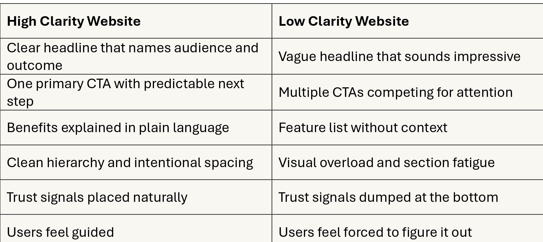
If your website behaves like the right column, your product might still be great. It is just not being understood fast enough.
How to Close the Clarity Gap Step by Step
Now the practical part.
Here is the process we use to close clarity gaps without turning your website into a wall of text.
Step 1: Rewrite the First Message, Not the Whole Website
The hero section is the clarity gateway.
Your hero must answer:
- What this is
- Who it’s for
- What outcome it delivers
A strong structure looks like:
Headline: Outcome + audience
Subheadline: How it works in one sentence
CTA: One primary action
Micro reassurance: what happens next
Example format (not copy, just structure):
- “Track every customer conversation in one place.”
- “Built for fast growing B2B teams who need visibility without complexity.”
- “Book a call”
- “No pressure, we will walk you through it.”
Step 2: Remove Competing Messages Above the Fold
If you have:
- 3 slogans
- 2 product categories
- 2 CTA buttons
- a paragraph of buzzwords
You have noise.
Reduce the above the fold area to one job: orientation.
Step 3: Translate Features Into Outcomes
Don’t just say what the product does. Say what it enables.
Instead of:
“AI powered workflows”
Say something like:
“Reduce manual steps and keep tasks moving without constant follow ups.”
Users need to see themselves winning.
Step 4: Make Proof Feel Real, Not Decorative
Logos help, but they are not enough.
Better proof looks like:
- Results and numbers
- Specific use cases
- One strong testimonial that says something concrete
- Screenshots of real product moments (if possible)
Proof should reduce uncertainty, not just decorate credibility.
Step 5: Make the Next Step Predictable
Users hesitate when a CTA feels like a trap.
If your CTA is “Book a call,” reassure them:
- How long it takes
- What they get
- That it is not a hard pitch
Clarity in the next step increases conversion more than a louder button color.
The Clarity Checklist You Can Apply Today
If you want a quick self audit, use this checklist:
Message
- Can a new visitor explain what you do in one sentence after 5 seconds?
Audience
- Does the headline clearly imply who this is for?
Outcome
- Do benefits describe results, not just features?
Next step
- Is the primary action obvious and predictable?
Trust
- Does the website feel intentional, coherent, and reliable?
Noise
- Are you showing everything, or the right thing?
If you fail even two of these, you likely have a Clarity Gap.
Final Thought
A good product is not enough.
Online, the best product does not win. The clearest product wins.
When clarity is high, users move forward with confidence.
When clarity is low, users hesitate even if your offer is exactly what they need.
Closing the Clarity Gap is not about making your website louder.
It is about making it easier to understand.
And when your website becomes easy to understand, conversion becomes the natural next step.