(And Why “Looking Premium” Is Really About Reducing Doubt)
People rarely say, “I don’t trust this website.”
They simply hesitate.
They don’t click.
They don’t sign up.
They bounce.
Trust is not a checkbox. It’s a feeling users form quickly, often before they can explain why. And while trust is influenced by your product, your pricing, and your reputation, websites create a powerful first impression that shapes how all of those things are perceived.
That first impression isn’t built by a single element.
It’s built by layers.
This is what we call the Trust Stack: a set of design signals that work together to make a website feel legitimate, reliable, and worth engaging with.
In this article, you’ll learn 12 trust signals that modern websites use to feel premium and credible, why they work psychologically, and how to apply them without overdesigning your site.
What the Trust Stack Is
The Trust Stack is the combined effect of multiple small design decisions that reduce doubt.
A single trust signal rarely changes conversion on its own. But when many signals align, users feel something important:
“This is real.”
“This is professional.”
“This is safe to explore.”
The Trust Stack is not about adding random credibility badges or stuffing your site with testimonials. It’s about designing an experience where trust is the default.
That’s why some websites look “legit” even when the company is unknown, and others feel questionable even with big claims.
Trust is not only what you say.
Trust is what users feel from the experience you deliver.
Why Users Decide Trust Faster Than You Think
Trust is formed early because the brain is protecting time and attention.
In digital environments, users constantly filter:
- What’s worth my focus
- What feels risky
- What feels low quality
- What might waste my time
When a website triggers doubt, users exit quickly. Not because they hate it, but because they have zero reason to gamble their attention.
Trust building is largely about removing friction.
A trustworthy website does not demand belief. It earns it through consistency, clarity, and calm confidence.
The 12 Design Signals That Build Trust
Below are 12 high-impact trust signals you can implement without redesigning your entire website.
The key is understanding that these signals work best as a system.
1. Clear Purpose Above the Fold
If users can’t tell what you do within seconds, trust drops immediately.
A legit website makes its purpose obvious, not poetic.
A strong above-the-fold section should answer:
- What this is
- Who it’s for
- Why it matters
- What happens next
Clarity creates confidence. Confidence creates trust.
2. Visual Hierarchy That Guides Attention
Trust is not just belief. It is also orientation.
Users trust interfaces that feel controlled. Controlled experiences have hierarchy.
When everything is equally emphasized, the website feels chaotic, and chaos signals unreliability.
Hierarchy is built through:
- spacing
- typography scale
- contrast
- layout structure
Good hierarchy reduces cognitive effort. Lower effort feels safer.
3. Consistency in Typography and Spacing
Nothing destroys trust faster than inconsistency.
Two slightly different button styles.
Random font sizes.
Different border radii.
Spacing that changes page to page.
Users may not notice these issues consciously, but their brain registers them as “unintentional.”
Legitimate brands feel deliberate.
Consistency is a quiet signal of competence.
4. High Quality Copy Tone
Trust is also linguistic.
If your copy sounds generic, exaggerated, or unnatural, users feel skepticism. If it sounds too salesy too early, they pull back.
Good trust building copy is:
- specific
- calm
- outcome oriented
- human
It doesn’t oversell. It explains.
5. A Primary CTA That Feels Safe
Many websites lose trust at the exact moment they ask for action.
If your CTA feels unclear, users hesitate.
Trustworthy CTAs feel predictable.
A good CTA answers:
- what happens next
- how much time it takes
- what the user gets
For example, “Book a call” becomes stronger when supported by a short reassurance line like:
“15 minutes. No pressure. We’ll recommend the best next step.”
That micro clarity builds trust.
6. Proof That Feels Real, Not Decorative
Logos can help, but they can also feel empty.
The proof that truly builds trust is specific.
Examples:
- measurable outcomes
- short case study snapshots
- client quotes that sound real
- visual evidence of work
Proof should reduce uncertainty, not just decorate the page.
7. Calm, Premium Use of Color and Contrast
Color choices affect perceived credibility more than most people think.
Overly aggressive contrast can feel cheap. Overly muted contrast can feel inaccessible. Inconsistent colors feel careless.
Premium brands use color intentionally.
Color should guide attention, not fight for it.
A legit website feels calm, not desperate.
8. Responsive Micro Interactions
Micro interactions build trust because they confirm cause and effect.
Hover states.
Button feedback.
Input validation.
Smooth transitions.
These moments tell users:
“The website is aware of you.”
A system that responds predictably feels safe.
9. Thoughtful Loading and Empty States
Empty states and loading states are trust moments.
If a page loads unpredictably or gives no feedback, users assume it is broken. If an empty screen looks like an error, users panic.
Legitimate products explain what’s happening.
A small “Loading your dashboard…” can change the user’s emotional experience completely.
10. Real Navigation, Not Guesswork
Users trust interfaces that feel navigable.
Navigation should be:
- predictable
- minimal
- meaningful
- consistent
If users don’t understand where to go, they feel lost.
Lost users don’t convert.
11. Accessibility Signals and Readability
Accessibility builds trust because it signals care.
You don’t need to be perfect to improve readability, but basics matter:
- font size that is comfortable
- contrast that is readable
- spacing that breathes
- mobile layouts that make sense
When a website is easy to read, users feel respected.
Respect builds trust.
12. Professional “Detail Work”
This is the final layer that often separates premium from average.
Details like:
- consistent icon style
- clean image crops
- aligned grids
- smooth spacing rhythm
- consistent button behavior
Legitimate websites feel like someone actually cared.
And that care is a signal users respond to instantly.
A Trust Stack Table: High Trust vs Low Trust Websites
Here is what trust looks like in practice.
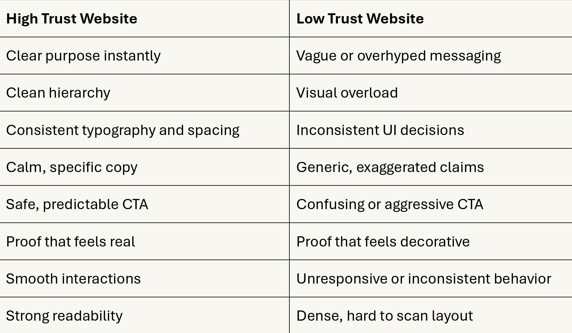
Trust is not one thing. It’s alignment.
How to Apply Trust Signals Without Looking Generic
There’s a common fear:
“If we add trust signals, will we look like every other SaaS website?”
Only if you do it without intention.
The difference between generic and premium is not the presence of trust signals, it is how they are designed.
Premium trust feels like:
- calm confidence
- selective proof
- clear structure
- consistent motion and spacing
Generic trust feels like:
- too many badges
- too many claims
- too many sections
- too much noise
Your goal is not to add everything. It’s to add only what reduces doubt.
Where Trust Signals Matter Most
Trust matters on every page, but it matters most in high-risk moments:
- pricing pages
- signup forms
- checkout flows
- contact pages
- proposal request forms
These are the moments where users feel uncertainty the strongest.
If the Trust Stack is weak, drop-offs happen here first.
A Practical Checklist to Audit Your Own Website
If you want a quick audit, use this checklist:
Clarity
- Can a new user understand what you do within 5 seconds?
Consistency
- Are typography, spacing, and components consistent everywhere?
Proof
- Do you show proof that feels specific and real?
CTA predictability
- Do users know what happens after clicking?
Interaction feedback
- Does the website respond smoothly to user actions?
Readability
- Is the experience comfortable on mobile?
If you answered “no” more than twice, the Trust Stack is likely leaking.
Final Thought
Trust is not a decoration layer.
It is the foundation that allows conversion to happen.
Your website can have great design and still feel untrustworthy if the Trust Stack is missing. But when clarity, consistency, proof, and predictable UX align, users feel something powerful:
“This is legitimate.”
And once users feel that, they stay longer, explore more, and act with far less hesitation.