(And why chasing trends quietly makes brands look cheaper over time)
Every few months, the design world declares something “modern.”
A new gradient style.
A new typeface trend.
A new layout pattern.
A new wave of motion effects.
Suddenly every website looks similar. Every brand refresh feels familiar. Everyone seems to be using the same visual language.
For a short moment, it feels exciting. Fresh. Current.
And then, just as quickly, it feels dated.
If you’ve ever opened an old startup website from five years ago, you’ve probably noticed how strongly it reflects its era. The colors, the illustrations, the animations, even the copy style instantly reveal when it was made. It doesn’t feel timeless. It feels stuck in a moment that has already passed.
That’s the problem with “modern” design.
Modern rarely means lasting.
Yet many startups and studios still chase it obsessively, believing that looking trendy will make them appear innovative or premium. Ironically, the opposite is usually true. The more a brand depends on trends, the faster it looks outdated, and the cheaper it feels.
Meanwhile, the brands that look expensive year after year tend to follow a completely different philosophy. Their design evolves slowly. It feels calm, restrained, and deliberate. You can’t easily tell which year their website was launched.
That’s not accidental.
It’s timeless design.
And timeless design sells longer.
The Obsession With Looking Modern
In the startup world, “modern” is often treated as a compliment. Founders want their product to feel cutting-edge. Designers want their work to look current. Marketing teams want visuals that signal innovation.
So when a new design trend appears, it spreads fast.
Not because it solves a real problem, but because nobody wants to look outdated.
This creates a subtle kind of peer pressure. If everyone else is using a certain aesthetic, not using it feels risky. Teams start to think, “Maybe we should update our site too. Maybe this new style is what modern companies look like now.”
The decision is rarely strategic.
It’s reactive.
And reactive design almost never ages well.
Because trends are, by definition, temporary. They are cultural waves, not structural improvements. Building your brand on them is like building a house on sand.
For a while, everything looks fine.
Then the ground shifts.
Why Trends Feel Attractive at First
It’s important to be honest about why trends are so tempting.
They work.
At least initially.
Trends create instant familiarity. When users see something that resembles other “modern” products, they subconsciously associate it with what’s current. It feels new. Energetic. Relevant.
This is especially powerful for early-stage startups trying to signal that they are innovative.
But this effect is shallow.
It’s surface-level relevance, not lasting credibility.
A design that feels trendy today often feels generic tomorrow. Because when everyone adopts the same style, differentiation disappears. Instead of standing out, brands blend together.
And when everything looks the same, nothing feels premium.
Premium brands don’t look like everyone else.
They look intentional.
The Hidden Cost of Trend-Driven Design
Trend-driven design doesn’t just age visually. It creates operational problems too.
First, it shortens redesign cycles. If your identity depends on what’s fashionable, you’ll feel pressure to refresh constantly. Every new trend makes your current design feel outdated. That means more redesigns, more budget, and more internal disruption.
Second, it weakens recognition. When your visual language changes drastically every year, users never build a stable memory of your brand. Recognition depends on consistency. Frequent stylistic shifts reset that memory.
Third, it lowers perceived maturity. Constant visual reinvention feels experimental, not established. High-value clients and enterprise customers often interpret this as instability.
Trendy brands feel like startups.
Timeless brands feel like institutions.
And institutions are trusted with bigger budgets.
What “Timeless” Actually Means
Timeless does not mean boring.
This is where many teams misunderstand the concept.
Timeless design isn’t minimal for the sake of minimalism. It isn’t old-fashioned. And it certainly isn’t static.
Timeless means resistant to trends.
It means choosing fundamentals over decoration.
It means designing systems that still make sense five or ten years from now.
When something is timeless, you can’t easily date it. You don’t think, “This looks like 2021 design.” It simply feels clear, usable, and intentional.
Think about brands like Apple, Stripe, or Notion. Their websites evolve, but slowly. The core principles stay stable. Typography remains restrained. Layouts stay structured. Motion is subtle.
They don’t chase what’s fashionable.
They refine what already works.
That’s the difference.
The Timeless Design Principles
Timeless design usually follows a few consistent principles.
First, clarity over decoration. Information is prioritized over visual effects. Layouts serve content, not the other way around.
Second, restrained typography. Instead of trendy fonts, timeless brands use neutral, highly legible typefaces that won’t feel outdated in two years.
Third, limited color systems. A small, controlled palette ages better than bold, experimental combinations that quickly feel tied to a specific era.
Fourth, subtle motion. Animation is functional and purposeful, not theatrical.
Finally, strong systems. Spacing, grids, and components follow clear logic. Consistency becomes the main aesthetic.
Individually, none of these choices are flashy. Together, they create something more valuable than novelty.
They create trust.
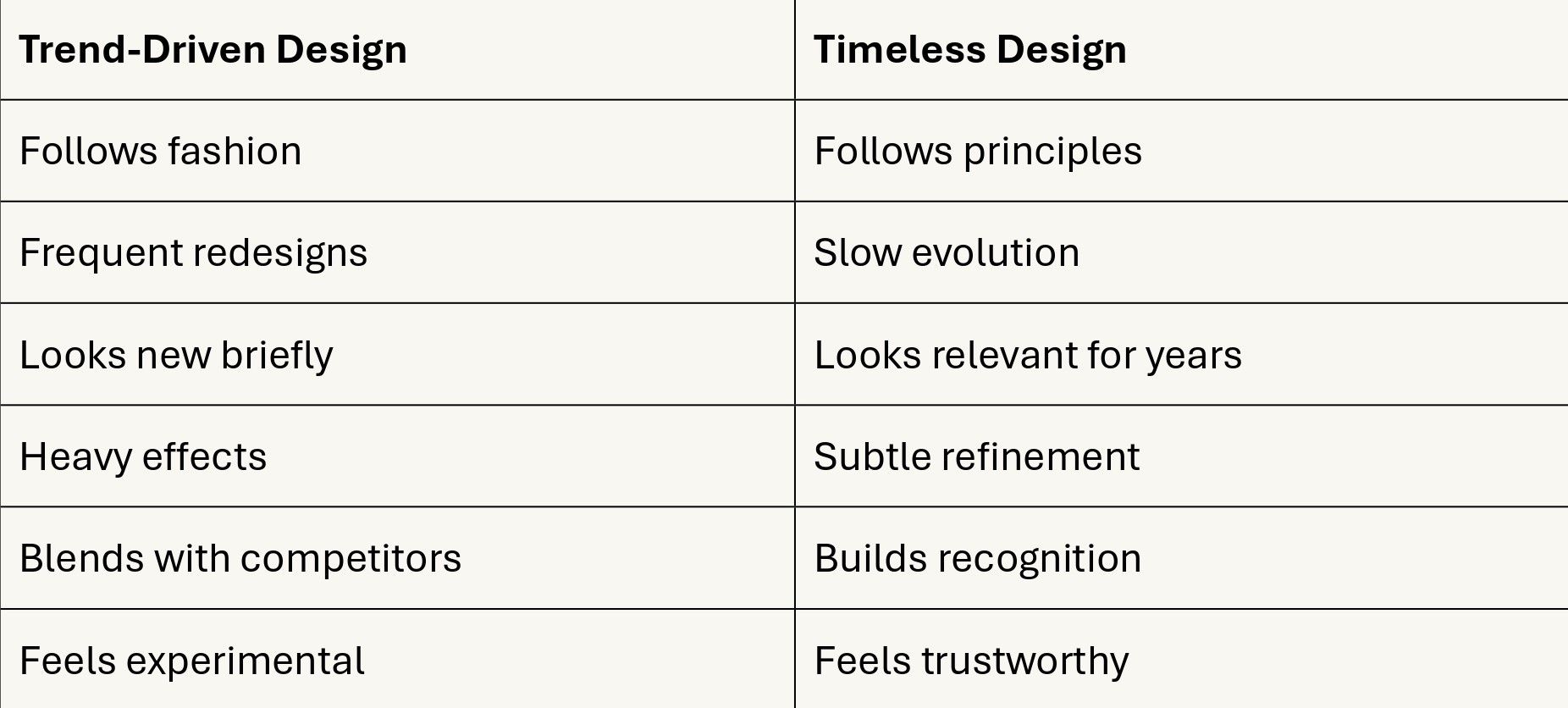
Trendy vs Timeless Comparison
This difference directly affects perception.
And perception directly affects sales.
How Premium Brands Age Gracefully
If you study brands that consistently feel premium, you’ll notice something interesting. They don’t redesign dramatically. They refine.
Instead of jumping to the next visual trend, they make small, incremental improvements. Typography adjustments. Spacing tweaks. Better hierarchy. Slightly smoother interactions.
These changes compound over time.
The result is a design that feels modern without ever feeling trendy.
There’s a quiet confidence in this approach. It says, “We don’t need to prove we’re current. Our work speaks for itself.”
That confidence is exactly what high-value clients look for.
Because confidence signals stability.
And stability signals reliability.
A Practical Framework for Designing to Last
If you want your design to age well, start by asking a different question.
Instead of “Does this look modern?” ask “Will this still make sense in five years?”
Before adding a trendy visual element, test it:
Does it improve clarity?
Does it improve usability?
Or is it just decoration?
If it’s only decoration, it’s probably temporary.
Build around fundamentals first. Then add personality carefully.
Think in systems, not styles.
Styles change. Systems endure.
Final Thought
Modern design is seductive because it promises instant relevance.
But instant relevance is short-lived.
Timeless design is quieter. Slower. Less flashy.
Yet it compounds in value year after year.
Brands that chase trends constantly restart their identity. Brands that invest in timeless systems build recognition, trust, and authority over time.
In the long run, the calm option usually wins.
Not because it looks exciting.
But because it keeps working long after the excitement fades.