(And What Makes Them Decide to Stay)
Users don’t leave websites because they are impatient.
They leave because the website doesn’t answer their questions fast enough.
In the first few seconds after landing on a page, users make a series of subconscious judgments. They don’t read. They don’t analyze. They scan, orient, and decide whether continuing feels worthwhile.
If clarity is missing during this brief window, users exit quietly—often without scrolling or interacting at all.
This article explains why users abandon websites so quickly, what actually happens during those first ten seconds, and how better UX decisions can significantly reduce early exits.
What Really Happens in the First 10 Seconds
When users land on a website, they are not engaging with content in a meaningful way.
They are orienting themselves.
During this short period, the brain is trying to determine whether the page matches the user’s intent. This process is fast, instinctive, and largely subconscious.
If orientation fails, exploration never begins.
The Questions Users Ask Without Realizing It
Even before reading a single sentence, users are mentally checking a few things:
- Am I in the right place?
- Is this relevant to what I’m looking for?
- Does this feel trustworthy?
- What am I supposed to do here?
If the answers are not immediately clear, uncertainty appears. Uncertainty increases cognitive effort. Increased effort encourages exit.
This entire chain can unfold in seconds.
Why Confusion Triggers Immediate Exits
Confusion is not neutral.
When users feel confused, they don’t slow down to understand. They speed up to escape.
Common sources of early confusion include:
- Vague headlines
- Competing calls to action
- Overloaded layouts
- Unclear value propositions
None of these require deep interaction to detect. Users sense them instantly.
Early exits are often the result of too much information presented too early, not too little.
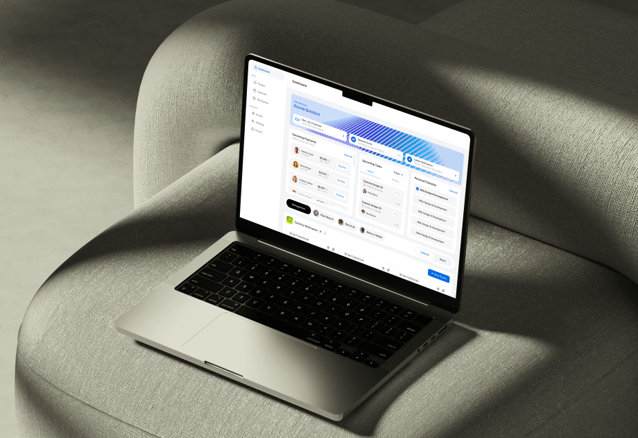
Above-the-Fold Clarity and First Impressions
The area visible without scrolling carries disproportionate weight.
If users cannot quickly understand what the website is about and why it matters to them, hesitation sets in. Hesitation is dangerous at this stage.
Strong above-the-fold content does not explain everything. It establishes relevance and direction. Details can follow once users feel oriented.
Visual Hierarchy vs Visual Overload
Visual hierarchy quietly guides attention.
When hierarchy is clear, users know where to look first and what matters most. When hierarchy is weak, everything competes for attention and nothing stands out.
Visual overload increases cognitive load. Increased cognitive load shortens attention.
Websites that respect hierarchy feel easier to navigate—even before users interact.
Trust Signals and Perceived Credibility
Trust is formed faster than logic.
Users evaluate credibility based on:
- Visual consistency
- Tone of language
- Layout stability
- Familiar patterns
Small inconsistencies can undermine trust before users consciously register why. When trust feels uncertain, users hesitate. When hesitation appears early, exits follow.
Trust doesn’t need to be earned immediately—but it must not be questioned.
Performance, Stability, and Perceived Speed
Performance issues don’t need to be severe to cause abandonment.
Minor delays, layout shifts, or unresponsive elements can signal instability. These signals are subtle, but they matter.
Perceived speed is often more important than actual speed. Smooth transitions and predictable behavior make experiences feel reliable—even if loading takes a moment longer.
Stability reduces anxiety. Reduced anxiety keeps users present.
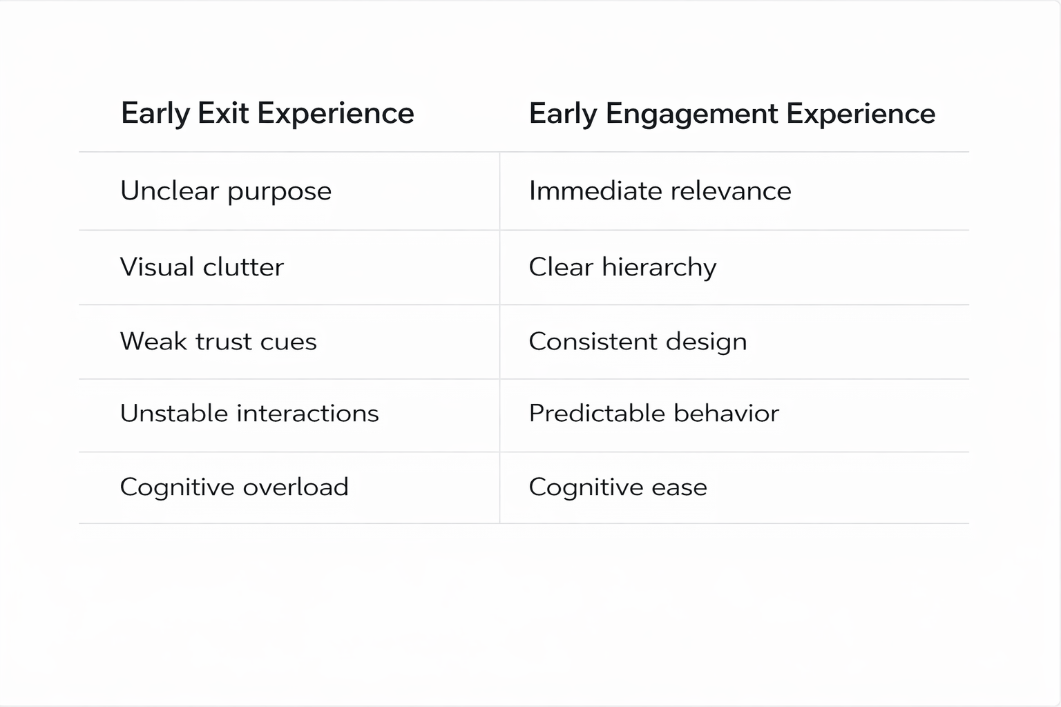
A Clear Comparison: Early Exit vs Early Engagement
Patterns become clear when comparing websites that lose users quickly with those that retain them.
Users stay when effort feels low and direction feels clear.
How to Reduce Early Drop-Offs
Reducing early exits does not always require a full redesign.
Often, small improvements make the biggest difference:
- Sharpening the main headline
- Simplifying above-the-fold content
- Reducing visual competition
- Clarifying the primary action
These changes lower cognitive effort. Lower effort increases willingness to continue.
Final Thought
Users don’t leave websites because they lack patience.
They leave because the experience demands clarity before it provides it.
The first ten seconds are not about persuasion. They are about orientation and confidence. When users immediately understand where they are, why it matters, and what to do next, they stay.
When they don’t, they leave—quietly and without feedback.
Designing for those first seconds is not about grabbing attention.
It’s about removing doubt.