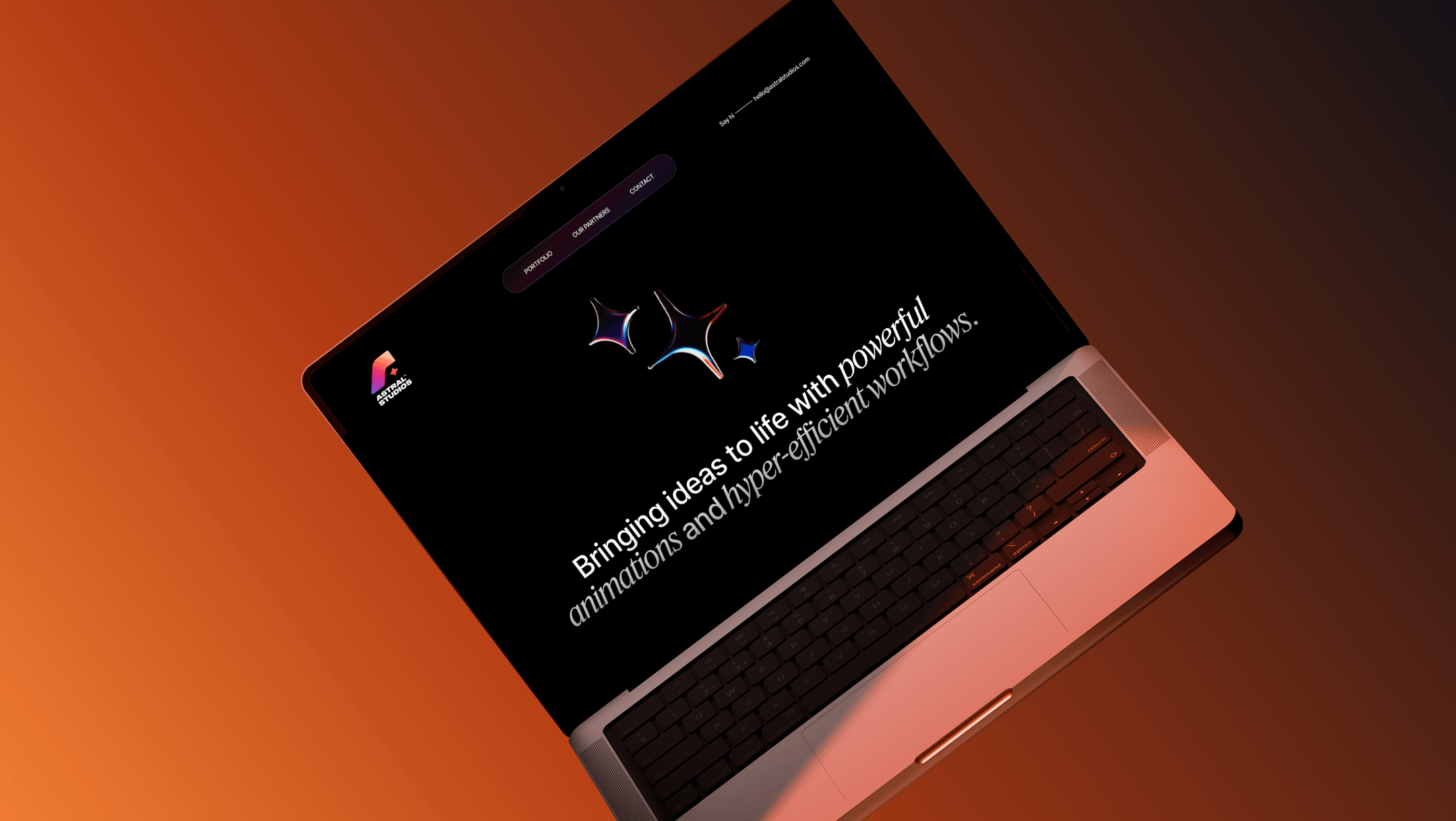
(The Hidden Signals Users Notice Before They Trust You)
A modern website is not automatically a premium website.
Many websites look “updated” but still feel cheap. Others look minimal and simple, yet feel expensive and high-end. The difference is rarely about a single design choice like color or typography.
It is about signals.
Users don’t evaluate a website the way designers do. They don’t analyze your grid or discuss your typeface choice. They absorb an overall feeling and decide whether your brand feels like it belongs in a premium category or a low-trust category.
That decision happens fast.
This article explains why modern websites can still feel cheap, what makes certain websites feel expensive even with minimal visuals, and how to design a premium perception without forcing luxury aesthetics.
Modern vs Premium: The Difference Most Teams Miss
Modern means your website looks current.
Premium means your website feels trustworthy, intentional, and high-value.
Modern design trends can help you look updated, but premium design is about control.
Control shows up in:
- spacing consistency
- typography rhythm
- how content is structured
- how motion supports interaction
- how decisions feel deliberate
- how the experience guides users
A website feels expensive when it looks like every detail was chosen intentionally.
A website feels cheap when it looks like details happened accidentally.
The Psychology of “Expensive” Design
Expensive design is not about looking luxurious.
It is about reducing doubt.
Users feel that a website is “premium” when it creates these emotions:
- confidence
- calmness
- clarity
- stability
- control
Premium websites do not demand attention. They guide it.
Cheap websites do the opposite:
- they compete for attention
- they add noise
- they feel unpredictable
- they feel rushed
This is why premium design often looks quieter than cheap design.
Premium does not look like effort.
It looks like restraint.
The 10 Signals That Make a Website Feel Premium
Below are ten signals that consistently create premium perception.
None of them require extreme creativity. They require consistency.
1. Spacious Layout and Confident White Space
Premium websites give content room to breathe.
White space is not “empty.” It is a signal of focus. It tells users what matters and what doesn’t. It also signals that the brand is not desperate to fill every pixel.
When spacing is tight and crowded, users feel pressure.
Pressure feels cheap.
2. A Clear Typography Hierarchy
Typography is one of the strongest premium signals.
Premium sites usually have:
- fewer font sizes
- consistent heading scale
- readable line height
- clear contrast between titles and body text
Cheap sites often suffer from typography chaos:
- too many styles
- inconsistent line spacing
- unclear hierarchy
- weak readability
If users struggle to scan your site, they assume your product will also be hard to use.
3. High Quality Copy Tone
Premium brands sound intentional.
They do not overpromise. They do not scream. They do not fill headlines with buzzwords.
Instead, they communicate clearly:
- what the offer is
- who it is for
- what outcome users get
Good tone feels human but confident.
Generic or exaggerated copy feels like low-trust marketing.
4. Consistent Details Across Components
Premium websites feel like a system.
Buttons behave the same everywhere. Cards follow consistent structure. Inputs feel unified. Icons match a style. Shadows and corners follow a rule.
Cheap websites feel like a collage.
Even if your layout is modern, inconsistency creates a cheap feeling instantly.
5. Calm Motion and Micro Interactions
Motion is one of the most underrated premium signals.
Premium motion:
- is subtle
- supports clarity
- reinforces cause and effect
- feels consistent
Cheap motion:
- is aggressive
- feels random
- distracts from content
- looks like a template effect
Motion should make the experience feel controlled, not flashy.
6. Sharp Visual Alignment
Users might not consciously notice alignment, but they feel it.
Premium websites have:
- consistent left edges
- consistent spacing between sections
- clean grid structure
- balanced layouts
When things “almost” line up, the site feels unfinished.
Unfinished feels cheap.
7. Intentional Use of Color
Premium websites use color selectively.
Color is often used to guide action, not decorate everything. Many premium sites rely on a neutral base with strategic highlights.
Cheap websites often overuse color:
- too many accent colors
- inconsistent gradients
- aggressive contrast without hierarchy
Color should create clarity, not chaos.
8. Proof That Feels Specific
Premium brands do not rely on generic testimonials.
They use proof that reduces doubt:
- short case study highlights
- measurable results
- client names or clear context
- real outcomes
Specific proof feels expensive because it feels real.
9. Strong Content Structure
Premium websites do not dump content.
They structure it.
They use:
- sections with clear purpose
- thoughtful pacing
- scan-friendly blocks
- clean hierarchy
Users feel guided. Guided feels premium.
10. A Clean, Predictable CTA Experience
Premium websites make action feel safe.
They do not overwhelm users with ten CTAs. They choose a primary path and support it.
They make it clear what happens next:
- “Book a call” becomes predictable
- “Request access” becomes safe
- “Get started” feels manageable
Unpredictable CTAs feel risky. Risk feels cheap.
The 8 Signals That Make a Website Feel Cheap
Now the uncomfortable part.
Most websites feel cheap for predictable reasons. It’s not because the company is low-quality. It’s because the execution is inconsistent.
1. Visual Overload Above the Fold
If the first screen is full of:
- multiple messages
- multiple CTAs
- too many visuals
- too much text
Users feel friction instantly.
Premium experiences start with clarity.
2. Template-Looking Layout Patterns
Templates are not bad, but they carry a “generic” smell when used without customization.
When users feel like they’ve seen your site before, it becomes harder to trust the uniqueness of your product.
3. Weak Typography and Spacing
Cheap sites often look cheap because the spacing and typography do not breathe.
Text feels cramped. The layout feels tight. Sections feel rushed.
This creates pressure instead of confidence.
4. Inconsistent UI Components
Buttons change style. Cards change structure. Icons change line weight. Headings shift randomly.
It looks small, but it feels huge.
Inconsistency signals lack of control.
5. Overly Salesy Language
Aggressive copy makes users defensive.
If your headline feels like an ad instead of a clear statement, trust drops. Premium brands explain. Cheap brands pressure.
6. Fake-Looking Proof
Stock images pretending to be customers. Generic reviews. Empty logos.
If proof looks manufactured, users assume everything is manufactured.
7. Poor Mobile Experience
Cheap experiences feel cheap the fastest on mobile.
If the site:
- feels cramped
- is hard to scroll
- has unreadable type
- has broken spacing
users lose confidence immediately.
8. Motion That Feels Like a Gimmick
A website can be modern and still feel cheap if motion is used without intention.
Animation should support clarity. If it exists for decoration, it reduces trust.
A Clear Comparison Table: Expensive vs Cheap Website Traits
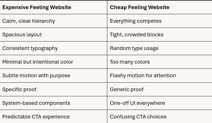
Premium perception is mostly about coherence.
How to Upgrade Your Website Without a Full Redesign
You don’t need to start from zero.
In many cases, upgrading perception is about fixing the highest-impact layers first.
Start with the hero section
If the above-the-fold experience is unclear, no amount of polish below will matter.
Focus on:
- a clear headline
- one strong CTA
- better spacing
- better hierarchy
Fix typography and spacing rules
Choose a clean hierarchy and apply it across the site.
Even a few consistent rules make the site feel dramatically more premium.
Reduce noise, not content
Premium sites are not empty. They are selective.
Remove what competes with the primary message.
Unify components
Pick one style for buttons, inputs, cards, and apply it everywhere.
Consistency is the fastest premium upgrade.
Where Premium Perception Matters Most
Premium perception matters most in high-stakes moments:
- pricing pages
- request demo pages
- booking calls
- checkout flows
- onboarding screens
These are the places where users are deciding whether your product is “worth it.”
A premium product with a cheap-feeling website loses opportunities quietly.
Final Thought
Modern design does not guarantee premium perception.
A website feels expensive when it feels controlled, consistent, and confident.
Users don’t need luxury visuals. They need an experience that reduces doubt. When clarity, hierarchy, typography, spacing, proof, and interaction patterns align, premium becomes a feeling users trust instantly.
And that feeling can be the difference between a website that looks good and a website that actually converts.